In the age of infographics, photo sharing, and YouTube, it’s hard to ignore the power of the image. A well-designed, well-thought out image can become a change maker in our society. We see this every day in our industry as we create advertisements and marketing materials set to create change for our clients, and oftentimes, the world.
I’ve been diving into the food and nutrition space lately, and have been bombarded with a large amount of food-related imagery. One particular image comes to mind, not because of its power to inform, but rather its complete lack of powerful influence.
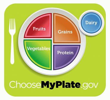
As part of Michelle Obama’s “Let’s Move” campaign to help teach kids the importance of eating healthy and staying active, Mrs. Obama and her marketing team dropped the well-known Food Pyramid and created the Food Plate. Many argued that the Food Pyramid was confusing and unclear, hence the transition. Yes, the Plate is far simpler, but is it more effective?
I recognize the Plate’s goal of visualizing meal portions, which it conveys well, but it says nothing about serving size, number of servings, or the types of food that fall into each food group. It resembles a glorified school cafeteria tray, which conjures up images of sloppy joes, tater tots and lime Jell-O. Would a young kid see those foods fitting within the protein, vegetable and fruit serving categories?
Kids need to know what healthy food looks like, how much of it they should eat, and the benefits associated with it. Portions are important, but not as important as the knowledge of nutrition. A plate is simply a means of transportation, a medium to some degree, but the medium is not the message. Let’s move beyond the plate and focus a design on the real societal change maker, nutrition.
